How to add JavaScript behavior to Bulma navbar in a React app
· 5 min read
So, if you already added Bulma to your project, it's very important to notice that the official documentation mentions that the library doesn't include any JavaScript.
In the case we want to use the navbar component, we would expect that if we click the hamburger button on a small screen size, it's going to expand so we can navigate the app using the items from the navbar-menu section. However if you try this, it won't work.
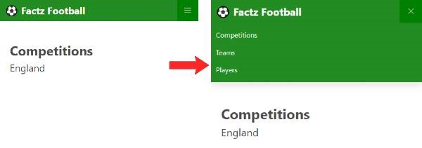
The behavior we want to achieve looks something like this:

The idea is simple: what controls this state on the navbar is a single class called is-active that has to be present on both the navbar-burger and the navbar-menu element.
In simple words, if we click the burger button we have to add the is-active class to both elements, and when we click the button again to close the menu, we have to remove the class.
The official documentation includes an implementation example in vanilla JavaScript that works fine, but I wanted to share my own implementation in a "React way" so you can use it in your own components.
import React, { useState } from 'react';

export default function Navbar() {

  const [navbarExpand, setNavbarExpand] = useState(false);

  return (
    <nav className="navbar" role="navigation" aria-label="main navigation">
      <div className="navbar-brand">
        <a className="navbar-item" href="https://bulma.io">
          <img src="https://bulma.io/images/bulma-logo.png" width="112" height="28">
        </a>
        <a
          role="button"
          className={`navbar-burger ${navbarExpand ? "is-active" : null}`}
          aria-label="menu"
          aria-expanded="false"
          data-target="navbarBasicExample"
          onClick={() => setNavbarExpand(!navbarExpand)}
        >
          <span aria-hidden="true"></span>
          <span aria-hidden="true"></span>
          <span aria-hidden="true"></span>
        </a>
      </div>
      <div
        id="navbarBasicExample"
        className={`navbar-menu ${navbarExpand ? "is-active" : null}`}
      >
        <div className="navbar-start">
          <a className="navbar-item">
            Home
          </a>
          <a className="navbar-item">
            Documentation
          </a>
          <div className="navbar-item has-dropdown is-hoverable">
            <a className="navbar-link">
              More
            </a>
          </div>
        </div>
      </div>
    </nav>
  );
};
Now that we have this full example, let's walk through the code step by step.
Setting up the component
First, we go to the Bulma documentation and grab the Navbar component from the components section (I removed navbar-dropdown and navbar-end for simplicity). Note that in the code snippet that Bulma provides, we have to replace all instances of class with className because we are working with JSX.
In this case I just copied and pasted the Basic Navbar.
Setting a variable for toggle state
With the help of the state hook, we are going to create a variable responsible for holding the state of the menu. By default it's going to be set to false, and when we click the hamburguer button, it's going to set the variable state to the opposite value the variable is set to.
This way we create a toggle effect.
Before I mentioned the is-active class and how two components rely on this class in order for this effect to work as expected. So, we take the navbar-burger and navbar-menu elements and change the className property with an object that contains a template literal. Inside we include the regular class the components had by default, and add a JavaScript operation. This operations basically says that if the toggle variable is true, we are going to add the is-active class, else we add nothing.
Creating the behavior trigger
Now that we have all the logic in place, we just need to add the event that's going to trigger this effect.
In this case I just spotted the hamburger button and added an onClick event to it with an inline arrow function responsible for changing the state of the toggle variable.
And that's it, now if we see the application on a small screen size, we can click the hamburger button and it will nicely display the items that are hidden on touch devices (in Bulma this is set at 1024px by default) and we can click again the "x" to close the menu.
Thanks.